The Anatomy of Trust: Geometric Branding in Health-Tech
By Mobina
In healthcare, aesthetics aren't a coat of paint; they are a trust-building mechanism. If a system looks clinical and cold, the user subconsciously prepares for bad news. That’s why in medical software, "pretty" is a secondary goal. The primary goal is authority. When Hooman Studio took on Pulsia, we were dealing with the most sensitive asset a human has: their heart data. To represent this, we couldn't just pick a "nice" green and a stock "plus" icon. We needed a visual language that felt as precise as the ECG algorithms running under the hood.
Moving Past the Medical Shorthand
The medical "plus" is the most overused icon in history. It’s often slapped onto MVPs as a shortcut for "trust." We wanted to move away from that cliché while still nodding to the industry's roots.
The Pulsia mark is a fusion of two distinct worlds: The Organic and the Engineered.
- The Leaf: Represents growth, vitality, and the "human" side of healthcare.
- The Pulse: Represents the data, the heartbeat, and the "tech" side.
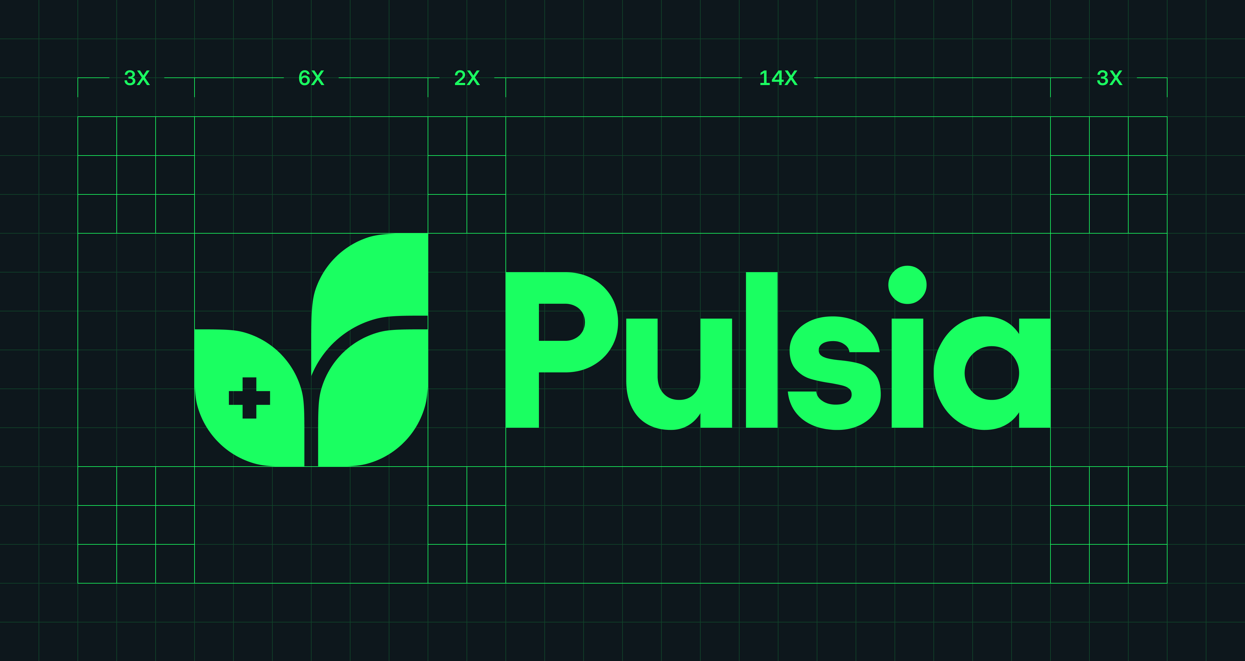
By tucking the medical plus into the lower-left curve of the leaf, we created a nested symbol that feels protected and integrated, rather than an afterthought.
The 3X/6X/14X Rigor
Good design is felt; great design is measured.
We didn't just eyeball the proportions of the Pulsia mark. We built it on a rigid mathematical grid to ensure scalability from a tiny 16px favicon to a massive physical billboard.
As seen in our technical schematics, the logo is governed by a specific ratio:
- 3X Spacing: The distance between the logo mark and the wordmark.
- 6X/14X Proportions: The internal height of the leaves and the vertical alignment of the "Pulsia" typography.
Why does ratio matter for SEO and brand authority?
Because the human eye perceives mathematical alignment as "stability." When the ratios are consistent, the brand feels "settled." In a sector where heart rates can be erratic, the brand needs to be the anchor.
Typography: Precision Without the Coldness
For the wordmark, we avoided the thin, spindly fonts often seen in luxury wellness. Pulsia needed to feel robust. We utilized a customized sans-serif with a high X-height and rounded terminals.
The "P" in Pulsia is heavy enough to command attention, while the lowercase "u" and "l" provide a rhythmic, approachable flow. This balance ensures that the brand doesn't feel like a cold pharmaceutical giant, but rather a helpful partner in your pocket.
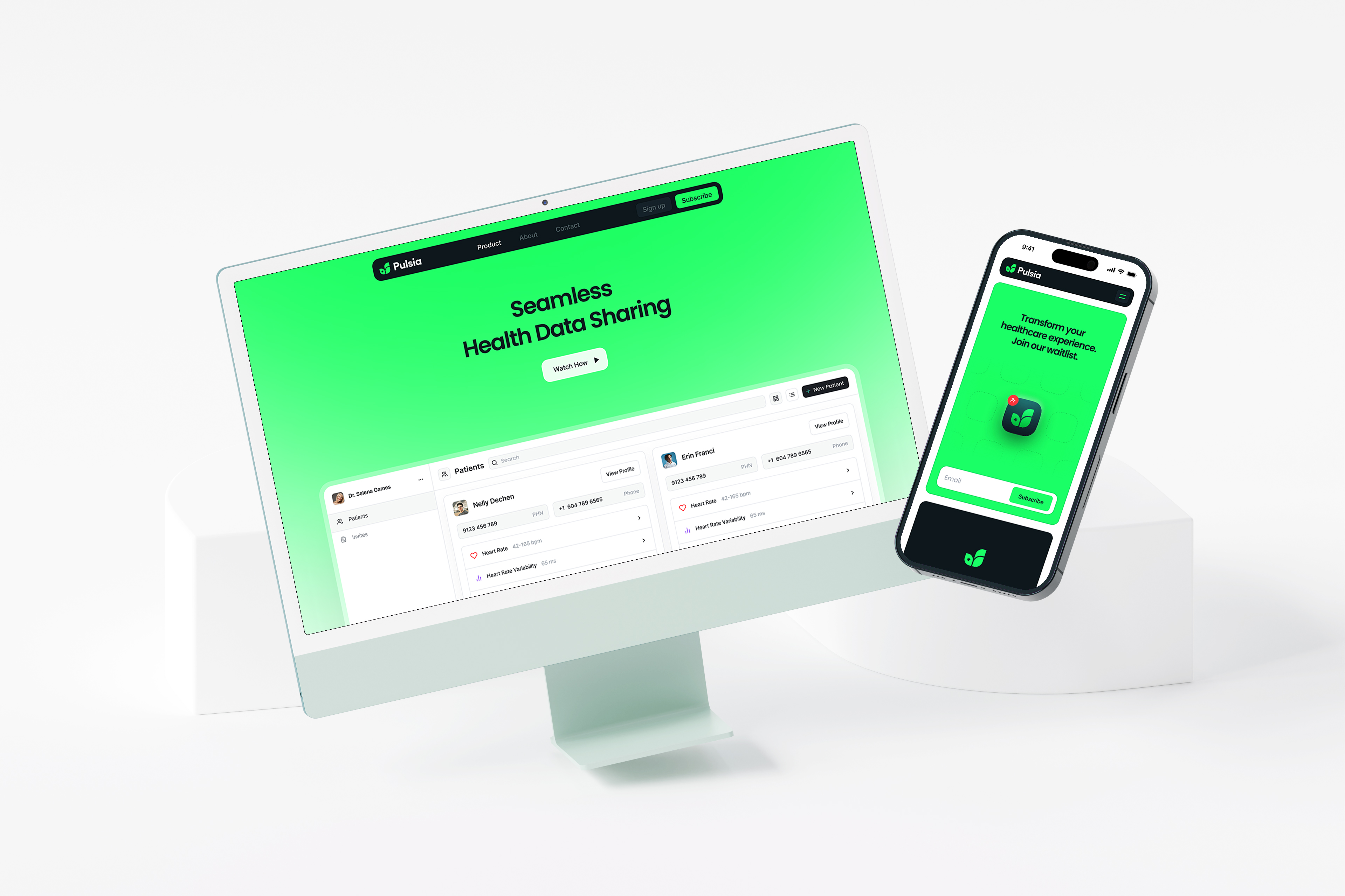
While this case study focuses on Pulsia’s identity system, the visual language didn’t stop at the logo. Many of the spacing rules, contrast decisions, and interface behaviors later shaped the product experience itself, especially inside Pulsia’s responsive dashboard ecosystem. You can see how those branding foundations translated into the live healthcare interface in our deeper breakdown of Pulsia’s responsive dashboard UX.
The "Pulse Green" Palette
Color theory in healthcare is usually a sea of "Blue #0000FF" (too corporate) or "Red" (too alarming). We landed on a vibrant, high-contrast green.
- The Psychology: Green signals "Go," "Health," and "Safety."
- The Technical: We ensured the green meets WCAG 2.1 accessibility standards when paired against the dark "Obsidian" background. In healthcare UX, if a visually impaired user can't read your brand, you’ve failed your mission.
The Hooman Dashboard Tie-In
During the branding phase, the Pulsia team wasn't just waiting for a final PDF. They were inside the Hooman Dashboard, watching the grid lines being drawn. We shared the "failed" iterations alongside the winners. We don't believe in the 'Big Reveal.' Through the Hooman Dashboard, Pulsia’s team saw every grid line as it was drawn. This wasn't about presenting a finished file; it was about ensuring the founders understood the mathematical foundation of their own brand.